Mobile Access
Available in SpiraTest, SpiraTeam, SpiraPlan
This section describes the functionality available in Spira when accessing the system from a mobile device such as an iOS® smartphone / tablet or an Android® smartphone / tablet.
The application has been designed to be fully "responsive", which means that it will dynamically rearrange the page based on the screen-sized used, to create an optimal experience on any device. As much as possible the application provides a consistent set of functions for any device. However, in order to make using the application on smaller devices as easy as possible, necessarily the experience on say, a smartphone, is less complete than on a desktop.
Whenever this user guide has referred to performing an action by 'clicking' if the same functionality is available, then 'tapping' on a mobile device will yield the same result. Due to the limitations of mobile devices, hovering over an element to display a "tooltip" is not possible.
Below, some illustrations of how the application looks at different screen sizes are provided.
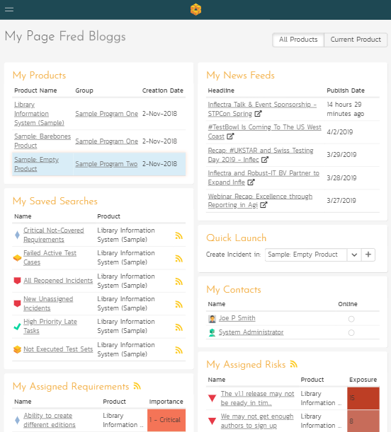
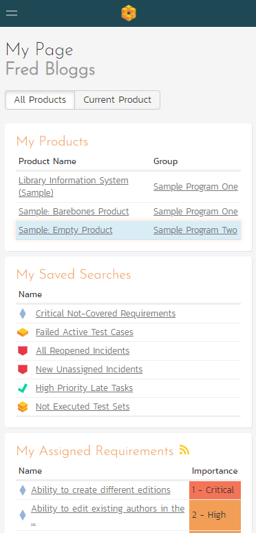
My Page
Desktop (a tablet in landscape mode will appear largely identical)
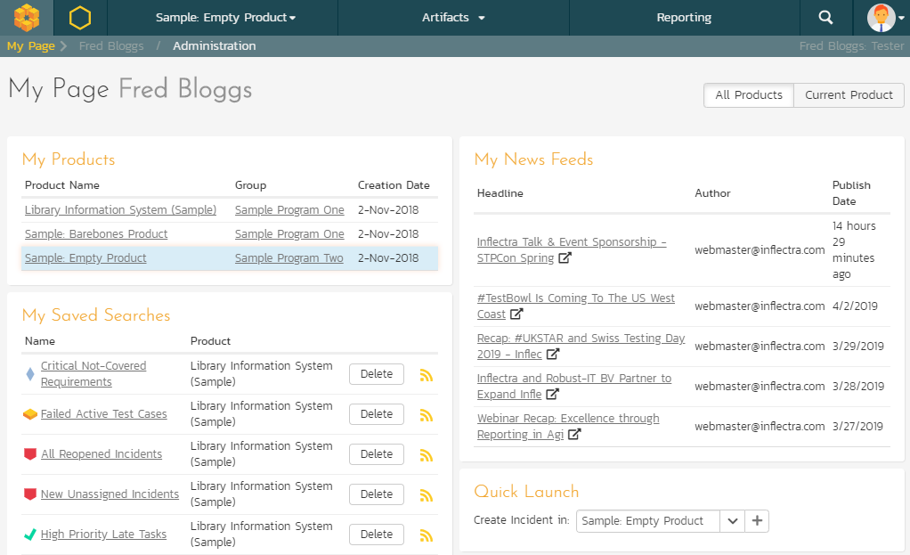
Table in portrait mode
Smartphone in portrait mode
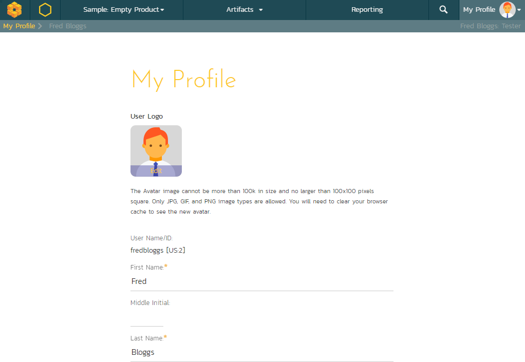
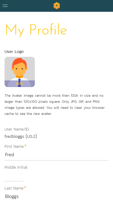
My Profile
Desktop (a tablet in landscape mode will appear largely identical)
Tablet in portrait mode
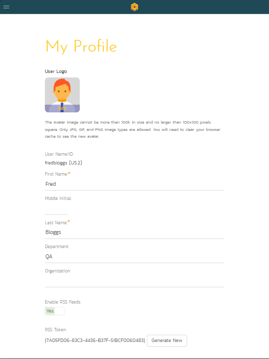
Smartphone in portrait mode
Example List Page
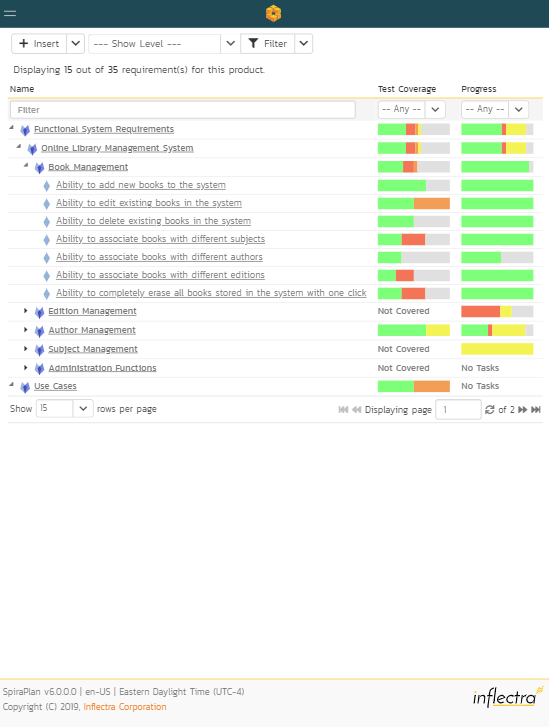
Desktop (a tablet in landscape mode will appear largely identical)
Tablet in portrait mode
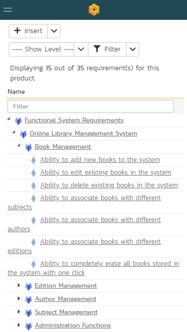
Smartphone in portrait mode
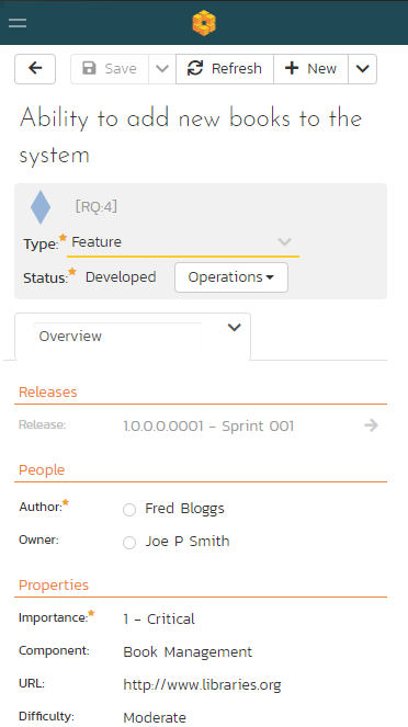
Example Details Page
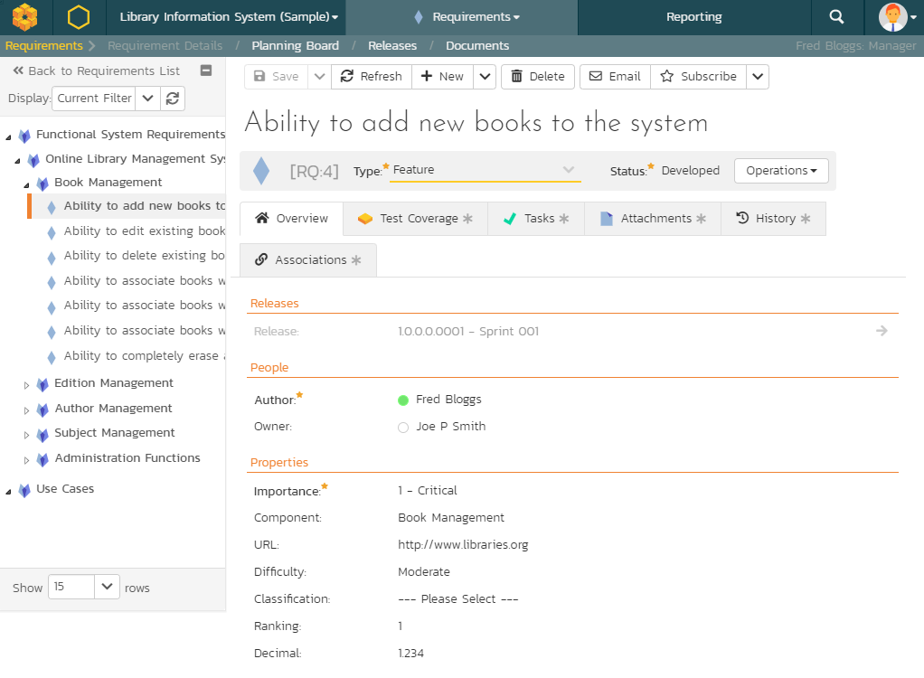
Desktop (a tablet in landscape mode will appear largely identical)
Tablet in portrait mode
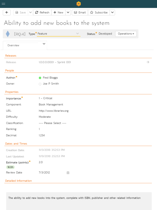
Smartphone in portrait mode
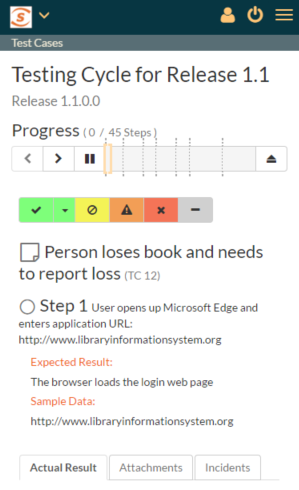
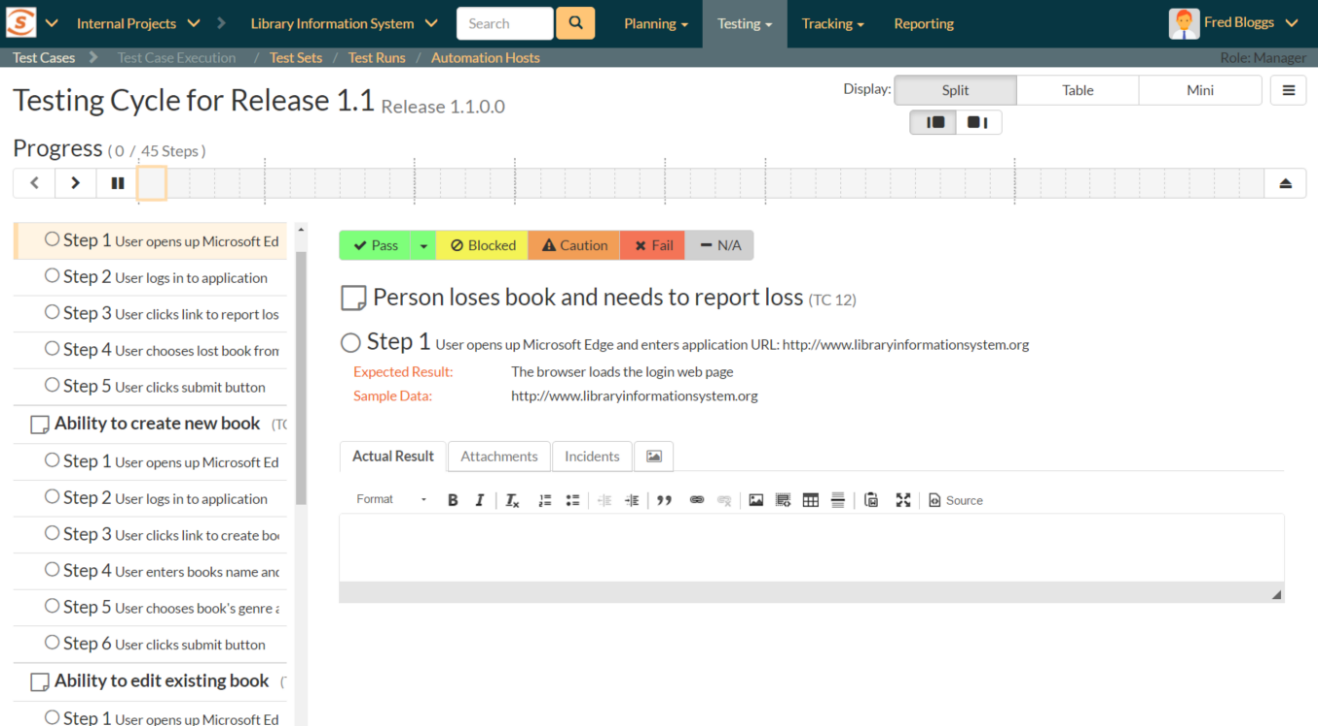
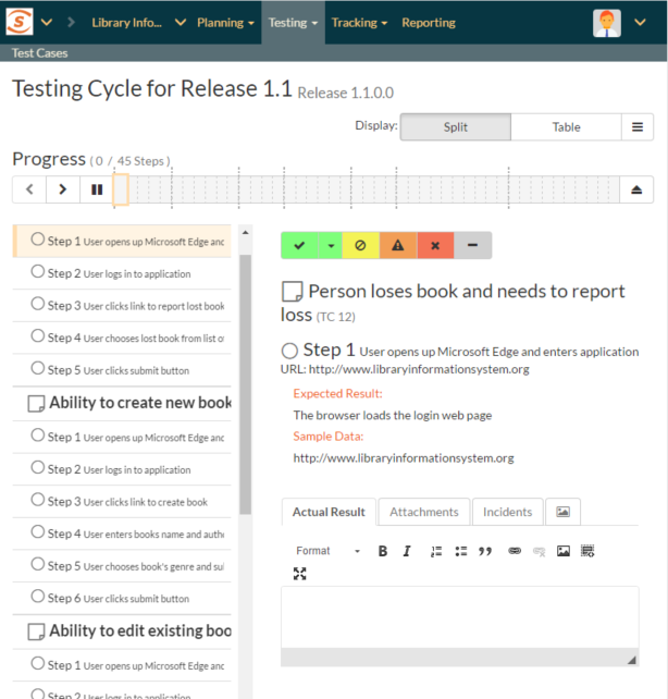
Test Execution
Desktop (a tablet in landscape mode will appear largely identical)
Tablet in portrait mode
Smartphone in portrait mode